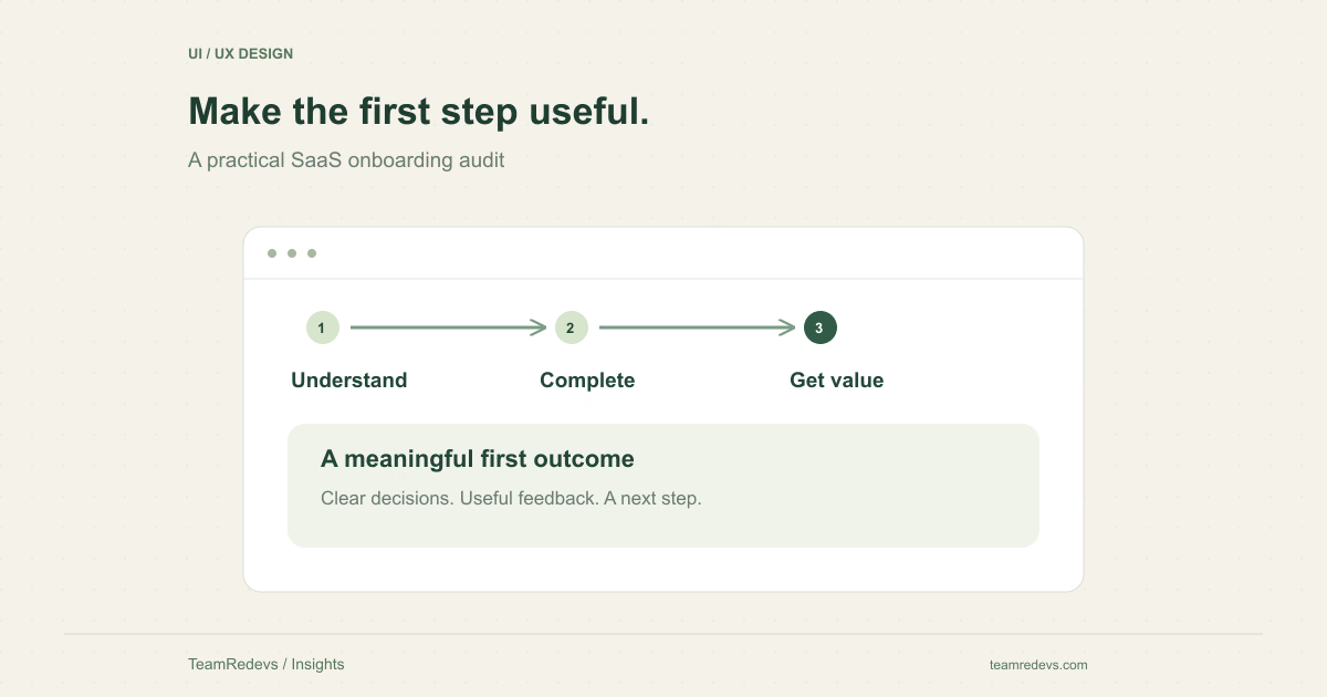
A SaaS onboarding UX audit asks whether a new user can reach a meaningful first outcome with understandable effort. It is a useful starting point when people register but struggle to begin, or when a team is considering a broad redesign without knowing which parts are failing. Audit the journey before changing the visual style: the largest problem may be a missing explanation, an unnecessary requirement, or a dead end after setup.
Define the first useful outcome in the user’s language
Account creation is a technical milestone, but it may not be the reason someone chose the product. In a scheduling tool, the useful outcome might be publishing a bookable appointment. In an email product, it might be sending and inspecting a test message. Pick an outcome that demonstrates value without pretending it represents every user’s long-term success.
Write a short scenario with a starting point and an observable finish. For example: a new workspace administrator invites a colleague who can then access the correct project. Use the scenario consistently during the audit so the team can compare observations rather than discussing unrelated preferences.
Map the decisions, not just the screens
Walk through the journey with a fresh account. At each step, note what the user must know, what the product explains, and what happens if a prerequisite is missing. A form that looks simple may depend on information the person does not yet have, such as a billing reference or domain setting.
Separate required setup from optional customization. If an input is genuinely essential, explain why it is needed and how the user can obtain it. If it can wait until after the first useful task, move it later. Do not remove meaningful requirements merely to reduce the visible number of steps.
- What decision must the user make here?
- Does the page explain unfamiliar terms?
- Can the user save progress and return?
- Is there a useful next action after completing this step?
Audit labels, errors, and keyboard access together
Form usability depends on identifiable controls, clear instructions, and understandable feedback. W3C’s forms guidance covers labels, grouping, instructions, validation, and notifications. Use it as a reference while checking the actual onboarding task, rather than treating accessibility as a visual polish step at the end. W3C accessible forms tutorial
Try completing the form with a keyboard, submitting an invalid value, and recovering without losing valid work. An error should identify what needs attention and help the person correct it. A placeholder that disappears during typing is not a reliable substitute for a visible label.
Test the empty, interrupted, and waiting states
A new user often encounters an empty dashboard, a pending invitation, an upload in progress, or a setup check that takes time. Review those states deliberately. They should explain what is happening and what the user can do, without presenting a failure as an empty success screen.
For the invitation example, inspect an expired invitation, an already-registered colleague, and a colleague with insufficient permissions. The product should distinguish these cases where appropriate. An attractive happy-path prototype can hide a confusing real-world journey if none of these states are considered.
Turn observations into a prioritized redesign brief
For each issue, record the user task, the observed behavior, the consequence, and the evidence. Separate a reproducible blocker from an untested hypothesis. Prioritize the issues that prevent the useful outcome or make recovery difficult; schedule low-impact visual inconsistencies after those.
A specific brief might say that administrators abandon invitations because the required permission level is unexplained. Proposed improvements could include clearer role descriptions, a safer default, and a visible confirmation. Validate the revised flow with representative users before extending the same pattern throughout the product.
Measure completion without confusing it with value
Measure whether users reach the defined first outcome, how long it takes, and where they need help. Pair those observations with follow-up behavior and support feedback. Fewer screens may improve completion, but it is not an improvement if users finish setup without understanding what they created.
TeamRedevs’ UI/UX design service covers research, user flows, prototypes, and reusable interface patterns. An onboarding audit can produce a focused set of changes before the team commits to a complete redesign. Explore our UI/UX design service
For an example of connecting interface choices to an operational workflow, read the reasoning behind Mailofly. Why we built Mailofly
Apply this to your product
Start with one user journey or integration in your current product. Document the expected behavior, review the linked source material, and agree on the checks needed before release. The right implementation depends on your existing architecture and operational requirements.
Further reading
MORE FROM OUR TEAM
Related Engineering Insights
Cloud-Native Application Modernisation in India: A Practical Guide for Growing Businesses
Plan cloud-native modernisation with a practical guide to modular architecture, APIs, observability, security and phased migration for Indian businesses.
Custom Logistics Software for Nagpur Businesses: Fleet, Warehouse and Supply Chain Management
Explore custom logistics software for Nagpur businesses, from fleet and warehouse workflows to shipment tracking, integrations and operational dashboards.
Hotel Website Development in Jaipur: Direct Booking Platforms, Guest Experience and Digital Growth
Learn how Jaipur hotels and hospitality businesses can improve direct bookings with fast websites, booking journeys, CRM integrations and mobile-first UX.